
BACKGROUND
Problem Statement
Product Solution
MY PROCESS


0.1 UNDERSTAND THE PLAYER
INTERVIEWS
To verify my assumptions about a scavenging app, and to begin the generative process, I conducted four scripted, F2F interviews with potential players. Since the app would be created for urbanites with free time, a discretionary budget and a hunger for cultural experience, and given the potential for adult content, I selected college-educated subjects over 21, skewing toward their 20s and thirties. However, it would be ill-advised to rule out retirees with a zest for experience and learning. So, I included one over-50 man.

All of the interviewees liked to explore cities in general, and New York City in particular. They all regularly sought new, out-of-the-way locations for pop culture, as well as drinks and food. Though only two had ever conducted a scavenger hunt, all the participants were enthusiastic about one dedicated to history, music, and mystery. Though they would use it to socialize with friends, and possibly with other players, they would not use it as a way of meeting people.
PERSONAS
After affinity mapping key findings, and cluster mapping emerging insights, I built three personas, which would ground the task analysis for user flows.


0.2 DESIGN
WIREFRAME AND PROTOTYPING
Starting with paper sketches, I built up digital work for testing.


After concepting on paper, I built medium-res wireframes in Balsamiq. However, it became abundantly clear with the medium-res screens that duplicating functions on the home and hunt screens was at best wasteful. So, I tweaked the architecture’s site map, before building a hi-res prototype.

0.3 USER TESTING & REVISION
With a high-res prototype on Invision, I was ready to conduct remote and F2F usability testing.

The objectives for testing were to determine if users understood the app, observe interaction for usability challenges, and note any opportunities for improvement. In 2 in-person and 4 remote sessions, subjects largely matching my personas consented to be recorded with the clickable Invision prototype.

0.4 USER INTERFACE
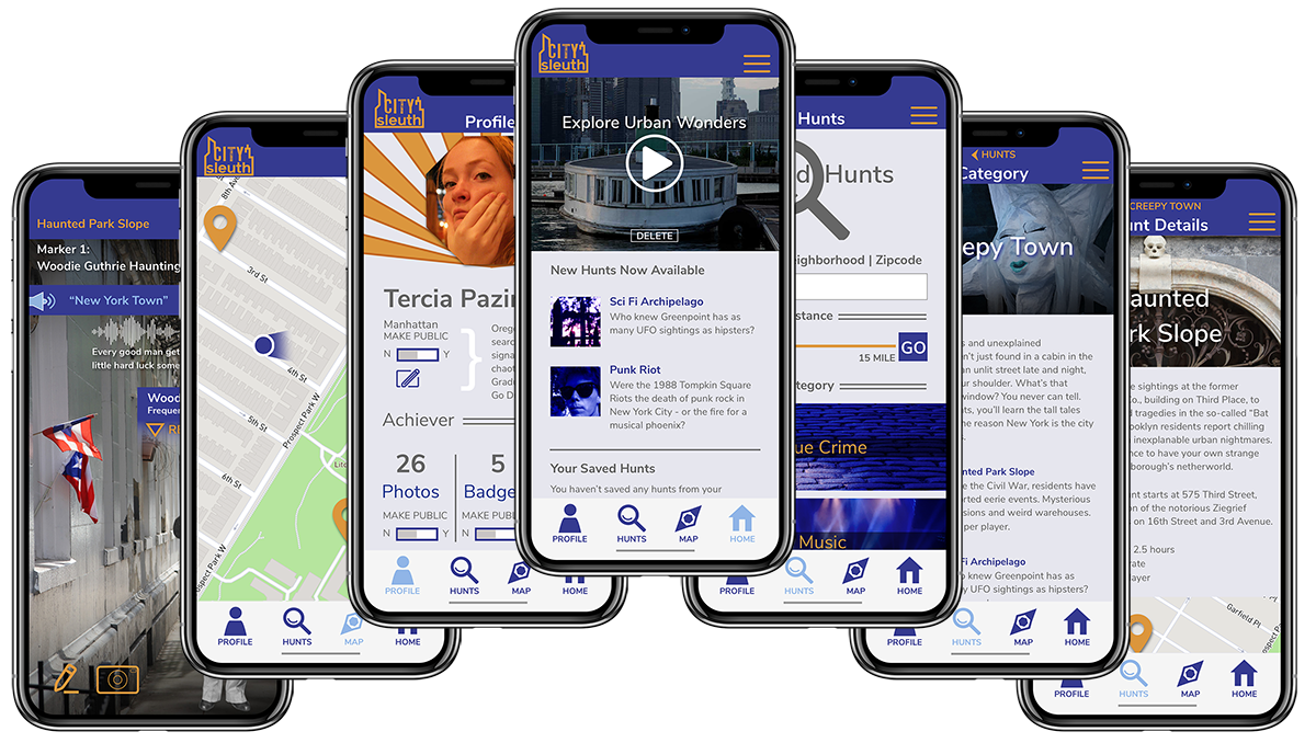
To view the current prototype, visit: https://invis.io/SVTB98UFC4Y
EPILOGUE
What Went Well:
• Initial generative research was very helpful in uncovering activities and apps that excite the customer base, and helped shape my product features. For example, I uncovered consistent desires for history, mystery and music, as well as shopping, food and drink. To launch a Minimal Viable Product, I eliminated all scavenging involving monetary transactions.
• Site-mapping refinement with card-sorting eliminated redundancies and superfluous design barnacles, and it streamlined user task flows. User input strongly trended in a couple of categories that helped refine an easy navigation for a simple architecture.
• User testing and peer reviews helped me shape my app into a well-recieved final prototype.
What Did Not Go Well:
• I scheduled inaccurately for my app.
• I had technical issues with recording remote user testing.
• It was a mistake to use an open card sort to evaluate an otherwise simple architectural structure. Subjects were very creative in both naming conventions and categorical association, which affected statistical correlation. Also, without a common nomenclature, many of the app’s features were sometimes whimsically grouped. I’m sure there would have been more rigorous thinking applied in a closed card-sort.
What Can Be Improved:
• Earlier and more frequent user-testing would help me build a simple and elegant architecture earlier, and also identify design choices that users tend to prefer.
• User content ratings for hunts have been suggested, and should be planned for in the next iteration. This would not only evaluate the features on existing hunts, but also provide invaluable insight into the development of new areas for business development.